Visualization Configurations
In this section, you will find example visualization configurations, along with screen captures of how the configurations are rendered, and a description of the different options.
Configuration Options Overview
The first key must be “visual_analytics_config” and the first value is a list, e.g.
{
  "visual_analytics_config": []
}
This first entry will have a title and sections – each section will correspond to a tab on the page. So the general structure looks like this:
{
  "visual_analytics_config": [
    "title": "My Graphs",
    "sections": [
      {...},
      {...}
    ]
  ]
}
Each section has a title and components, like so:
{
  "visual_analytics_config": [
    "title": "My Graphs",
    "sections": [
      {
        "title": "Mill Utilization",
        "components": [
          {...}
        ]
      },
      {...}
    ]
  ]
}
Each component has the following keys (optional ones are marked with
?):title: <string>; type: <string>; countType?: <string>; countFormat?: <string>; hideGraph?: <boolean>; eventFilters: ConfigEventFilter[]; metrics: ConfigMetric[]; span: <number>;titleis simply the name of the component, and it can be any string valuetypecan be set to one of the following:eventsTimeline: displays a timeline, where events are expected to have a start and an end and events happen in a sequence. This is useful for visualizing state machines.eventsTable: This displays data in a table format. This is useful for just seeing a history of all events that have occurred.countTable: This displays events with a summary metric (count). This is useful for obtaining a high-level picture of how many events of a particular type have occurred in the specified time range.countGraph: This displays a line plot of event counts in the specified time range.
countTypedetermines how the counts are computed forcountTableandcountGraph. It can be one of the following:eventCount: Count the total number of events.eventDuration: Sum the event durations.eventDurationAverage: Compute the average event duration.eventValueAverage: Compute the average value of the events.eventValueTotal: Sum the values across all events.
countFormatdetermines the display value and format of the count. It can be one of the following:wholeNumber: This is useful for counting discrete events, and will default to 0.average: This is used for displaying numerical data that represents an average count. This defaults to 0.percentage: defaults to 0% if missing, otherwise will display the value as a percentage out of 100.durationMs: defaults to 0, otherwise will return the duration in a time that is formatted appropriately for the current viewing time rangemostRecentTimestamp: Display the timestamp of the most recent event.start: Display the start timestamp.end: Display the end timestamp
hideGraphcan be set to true or false and toggles the display of the componenteventFilterskey has a value that is a dictionary, with the following format:"eventFilters": [ { "key": <string>, "values": [ <string> ] } ]
keycorresponds to the key in the data packet, such as zone_label, object_label, event_label, etc.valueis the value in the data packet for that particular key.
For example, if your data looks like this:
{
  "timestamp": "2024-07-25T00:39:00+00:00",
  "event_label": "operator_status",
  "object_label": "setup",
  "object_id": "d2acd9d7-49d7-4517-a113-896f0a9af383",
  "event_id": "02652472-72d1-411d-89ff-c139bdd0b8f6",
  "camera_label": null,
  "zone_label": "0",
  "data": null
}
And you want to plot events that happen in zone
0, you would use the following foreventFilters:"eventFilters": [ { "key": "zone_label", "values": [ "0" ] } ]
metricsfield will enable you to display a count of events whose key/value pairs match what you selected. You can provide the color each metric can include. This field is a list, so you can provide multiple metric configurations, as shown below.You could use a metric configuration like so:
"metrics": [
  {
    "title": "Hard Hat",
    "key": "event_label",
    "values": [
      "hard_hat_infraction"
    ],
    "color": "rgba(171,172,255,1)"
  },
  {
    "title": "Goggles",
    "key": "event_label",
    "values": [
      "goggle_infraction"
    ],
    "color": "rgba(242, 100, 48,1)"
  },
  {
    "title": "Vest",
    "key": "event_label",
    "values": [
      "vest_infraction"
    ],
    "color": "rgba(43, 213, 190,1)"
  }
]
For colors, you can consider using the Plotly default colors:
DEFAULT_PLOTLY_COLORS=['rgb(31, 119, 180)', 'rgb(255, 127, 14)',
                       'rgb(44, 160, 44)', 'rgb(214, 39, 40)',
                       'rgb(148, 103, 189)', 'rgb(140, 86, 75)',
                       'rgb(227, 119, 194)', 'rgb(127, 127, 127)',
                       'rgb(188, 189, 34)', 'rgb(23, 190, 207)']
spanis the width of the component, as an integer between 1 and 12. A span of 6 is half a page, a span of 3 is a quarter of a page, etc.
Examples
Manufacturing Example
You can download a manufacturing configuration example here: manufacturing_config.json. You can download example data that corresponds to this configuration/dashboard here: manufacturing-oct-dec-2024-analytics.txt
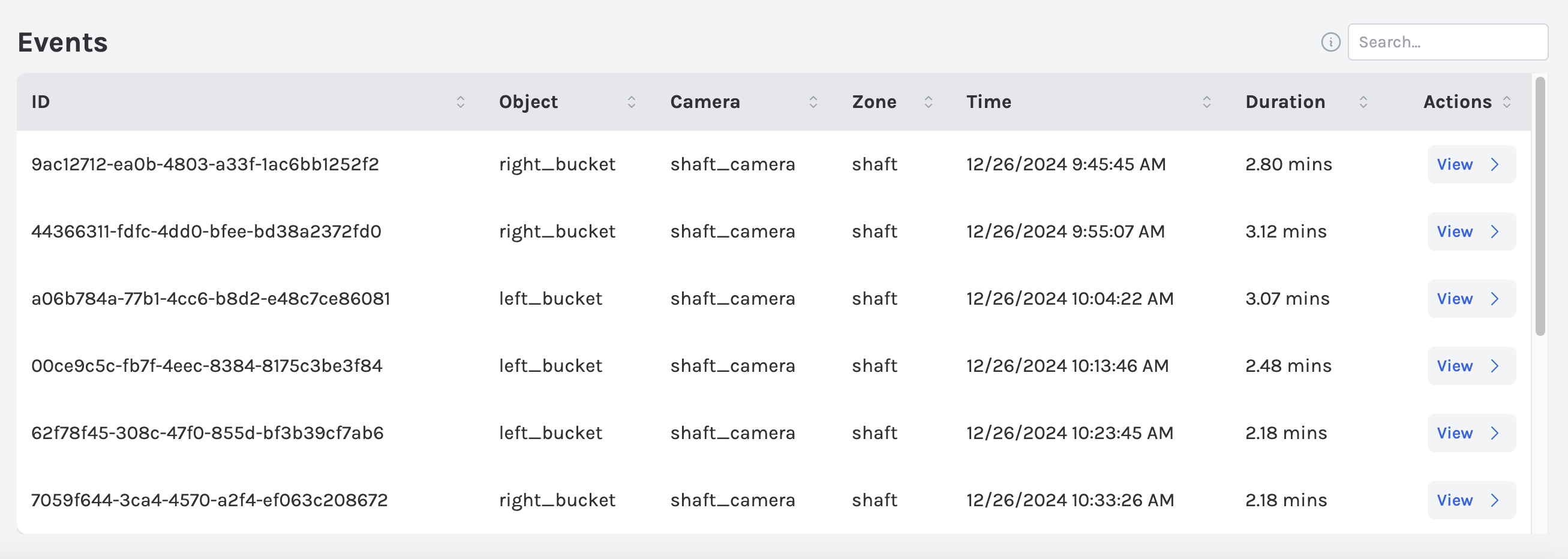
The following corresponds with the first component in the manufacturing configuration lines 10-70.
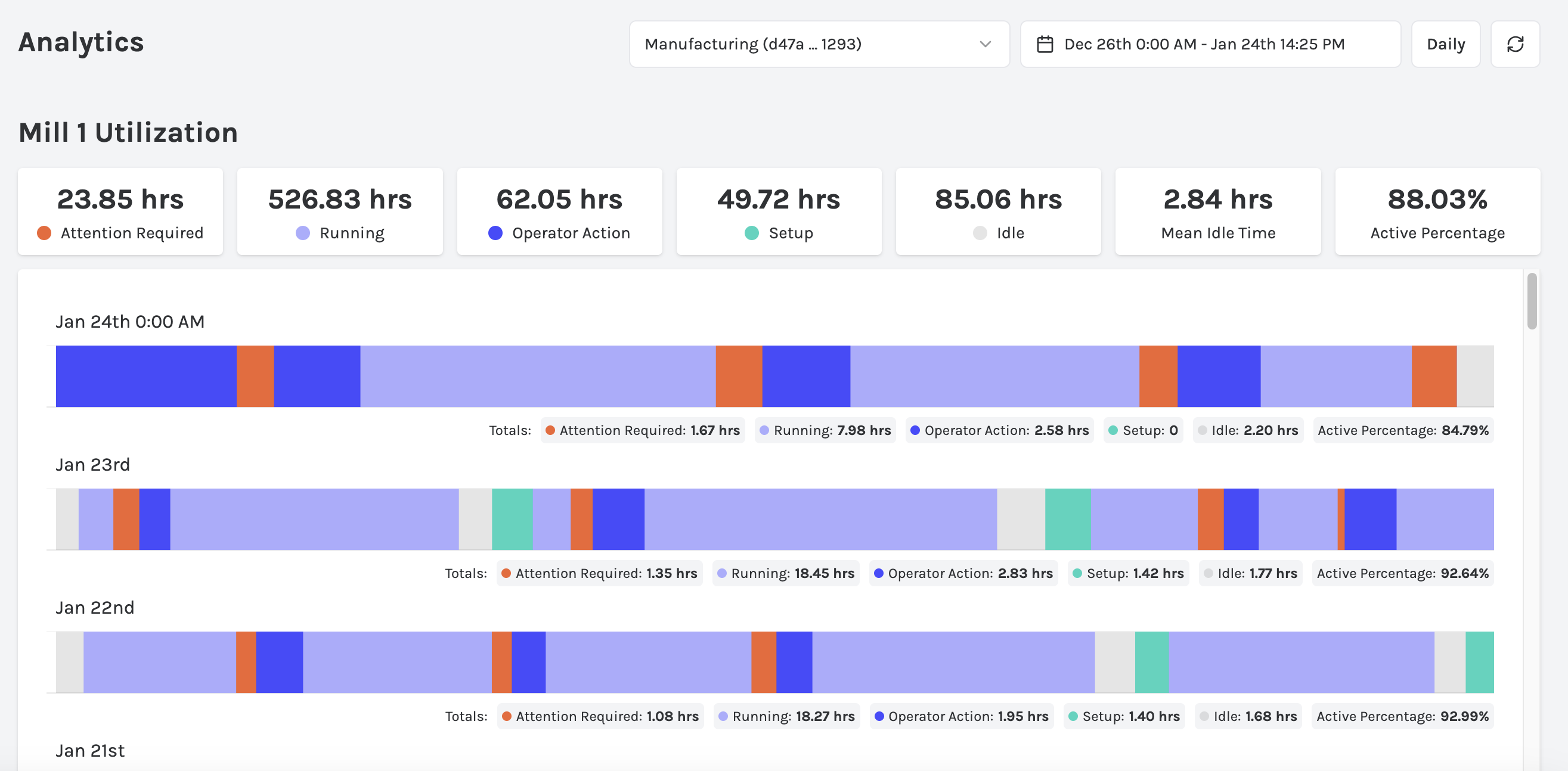
Next, the following corresponds to the next component, lines 71-132.
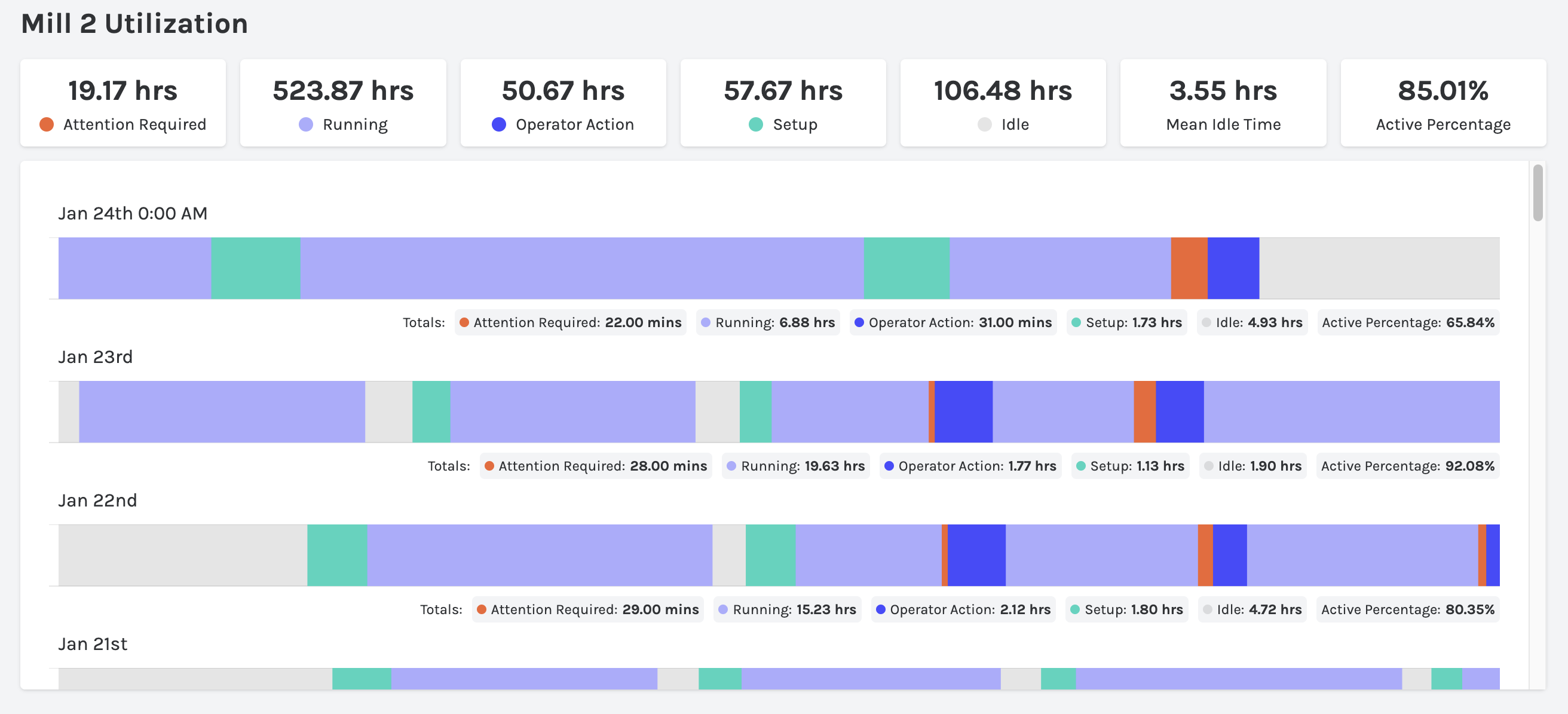
Then, lines 135-169 render to:
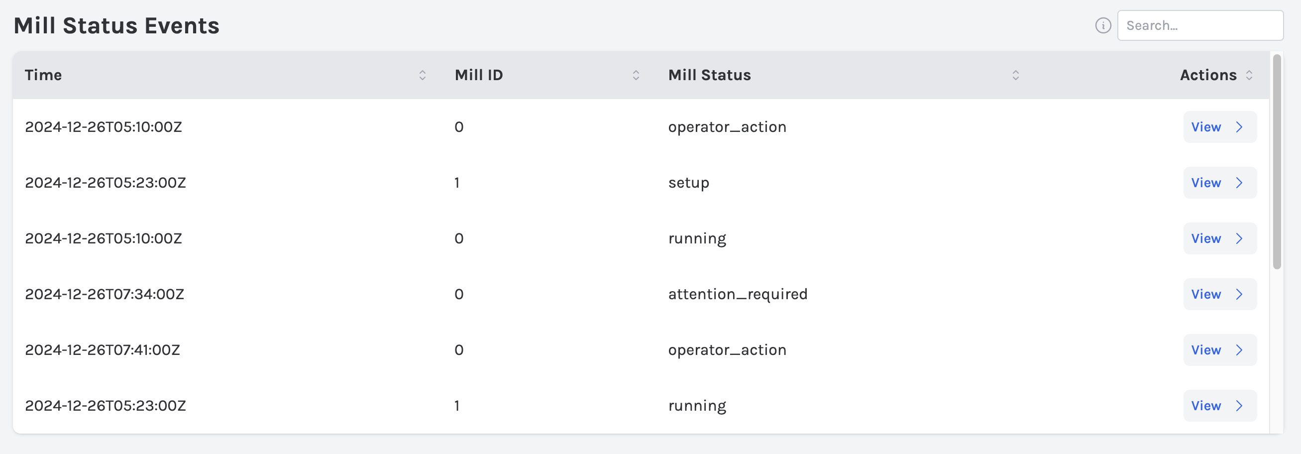
And finally the last component (171-205) renders to:
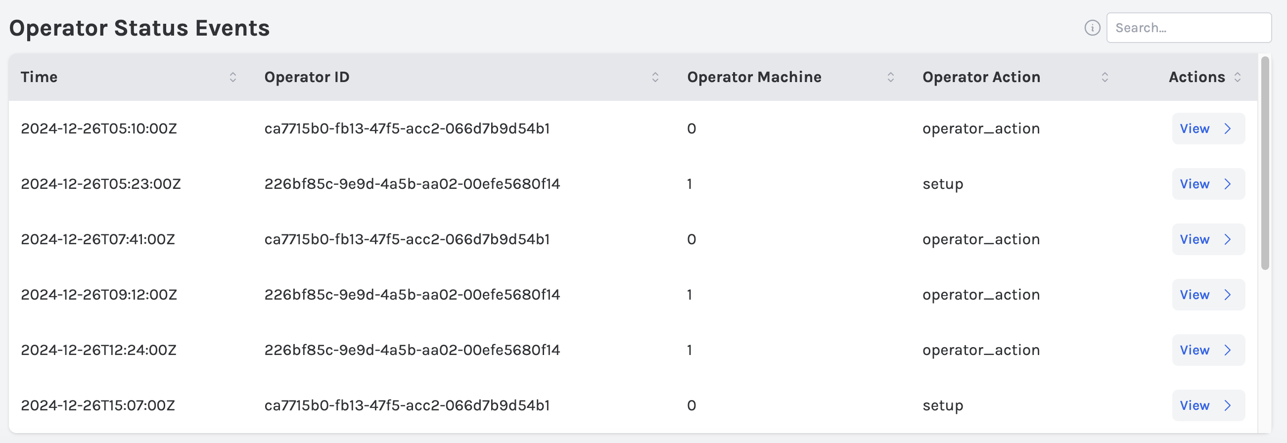
Mining Example
A slightly more complicated mining example can be downloaded here: mining_config.json. You can download example data that corresponds to this configuration/dashboard here: manufacturing-oct-dec-2024-analytics.txt
Mining Overview Tab
The below corresponds with the first component in the manufacturing configuration lines 6-72.
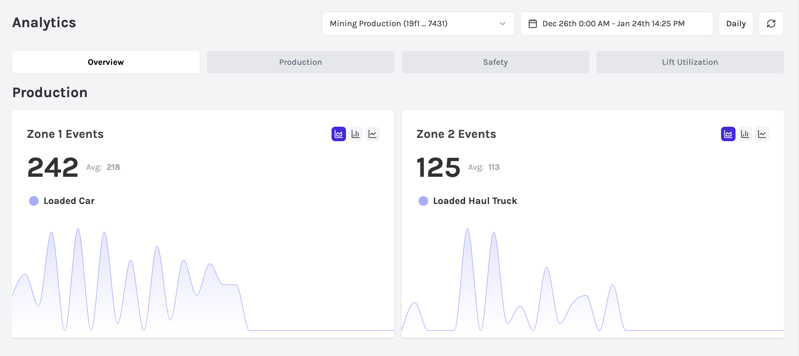
The following corresponds to the next component, lines 73-143.
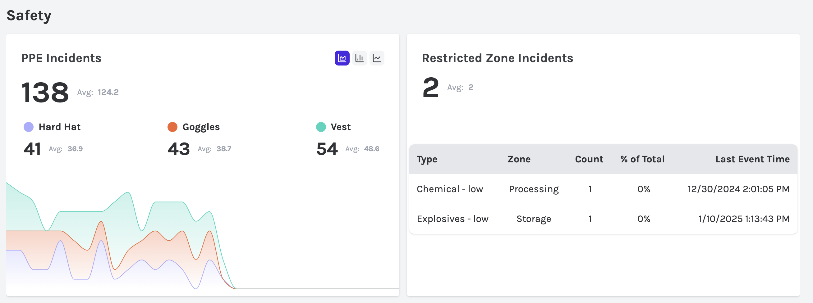
Then, lines 144-216 render to:
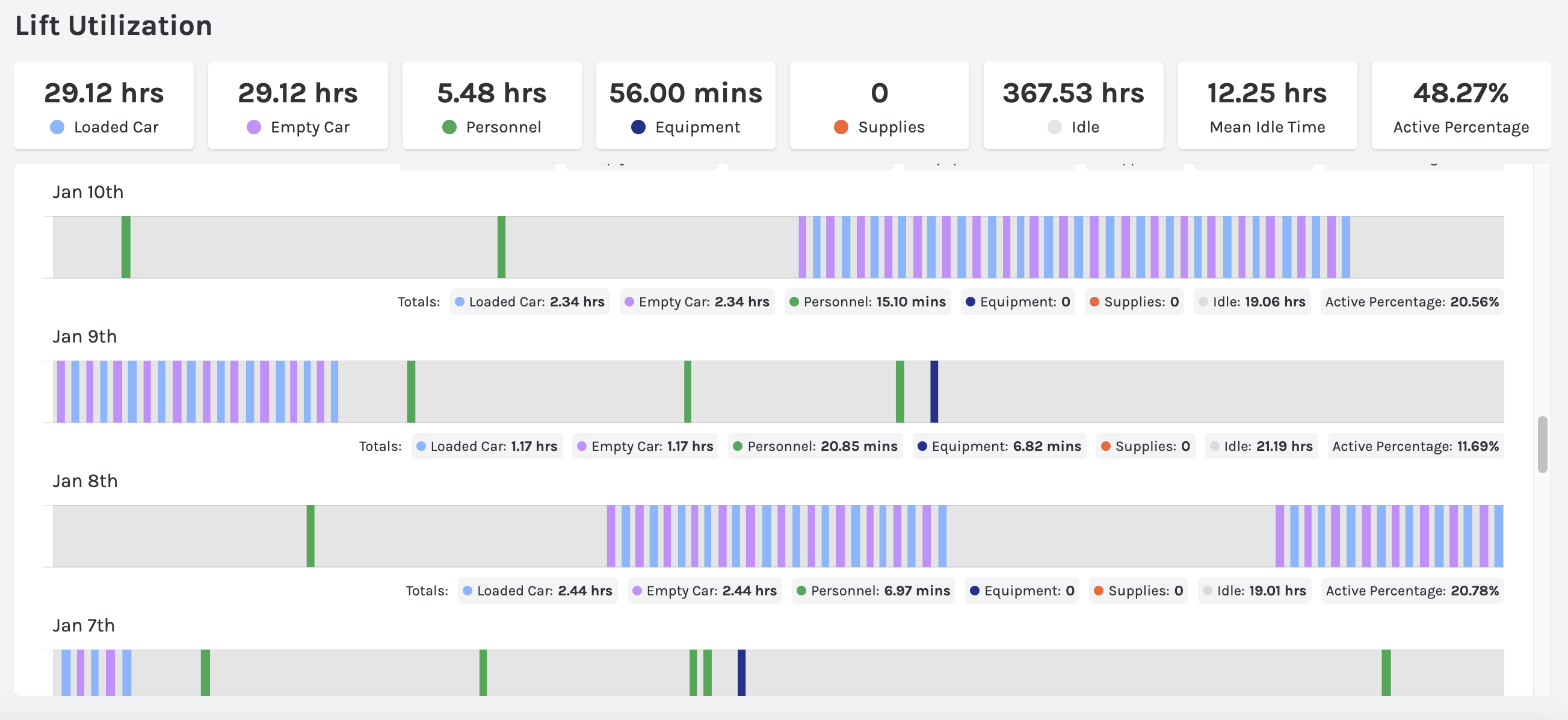
Mining Production Tab
Then, for the next tab (Production) corresponds to lines 219-386
The following is rendered by lines 226-284
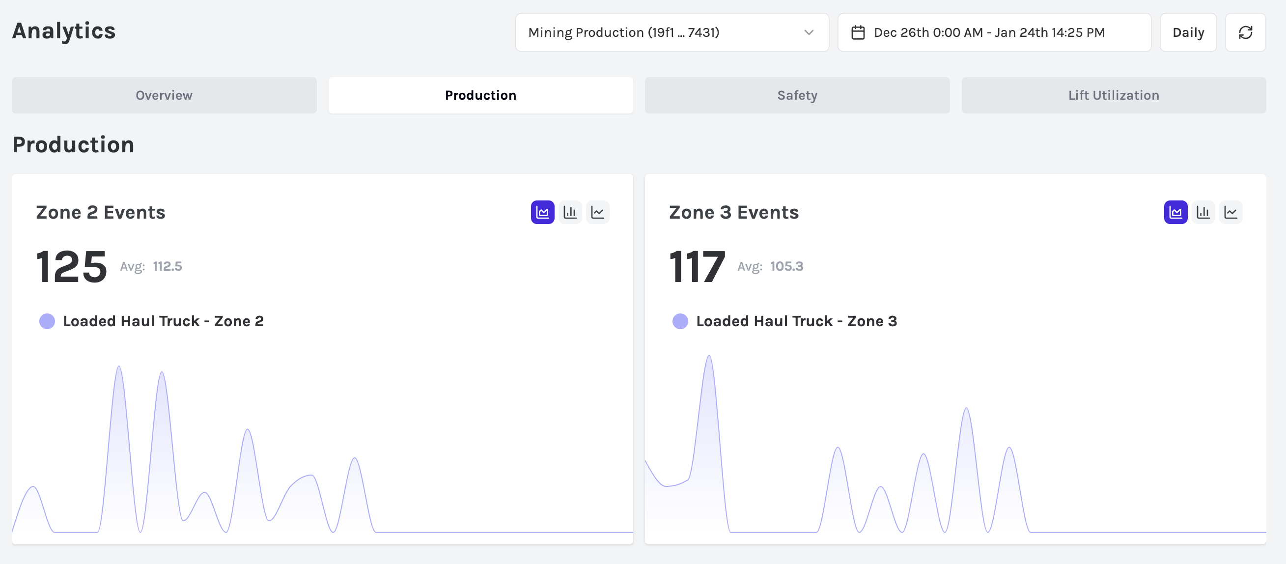
The following corresponds to lines 285-332

The following corresponds to lines 335-384
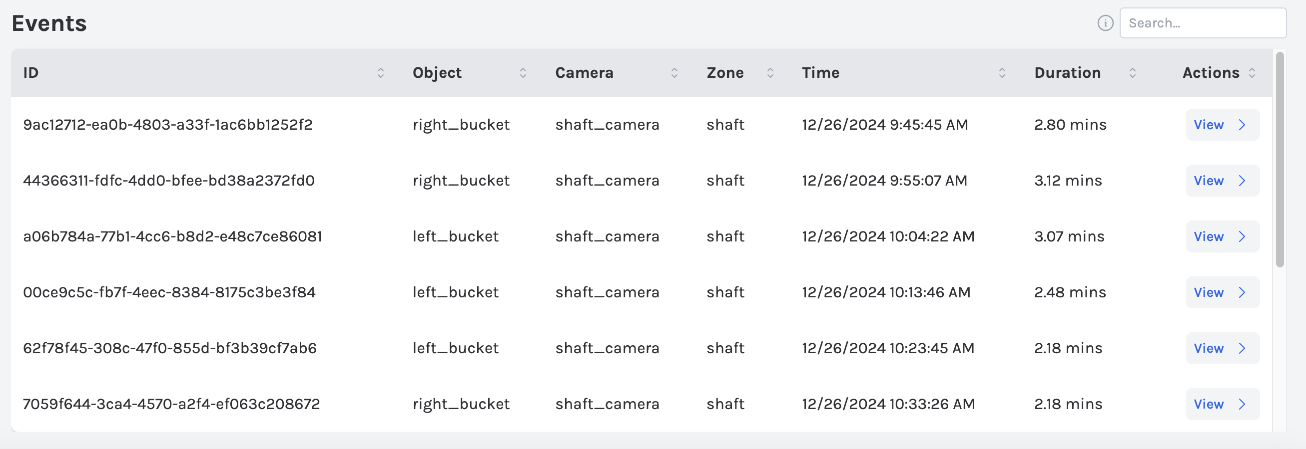
Mining Safety Tab
The Safety tab is rendered by lines 387-513.
The following corresponds to lines 390-460.
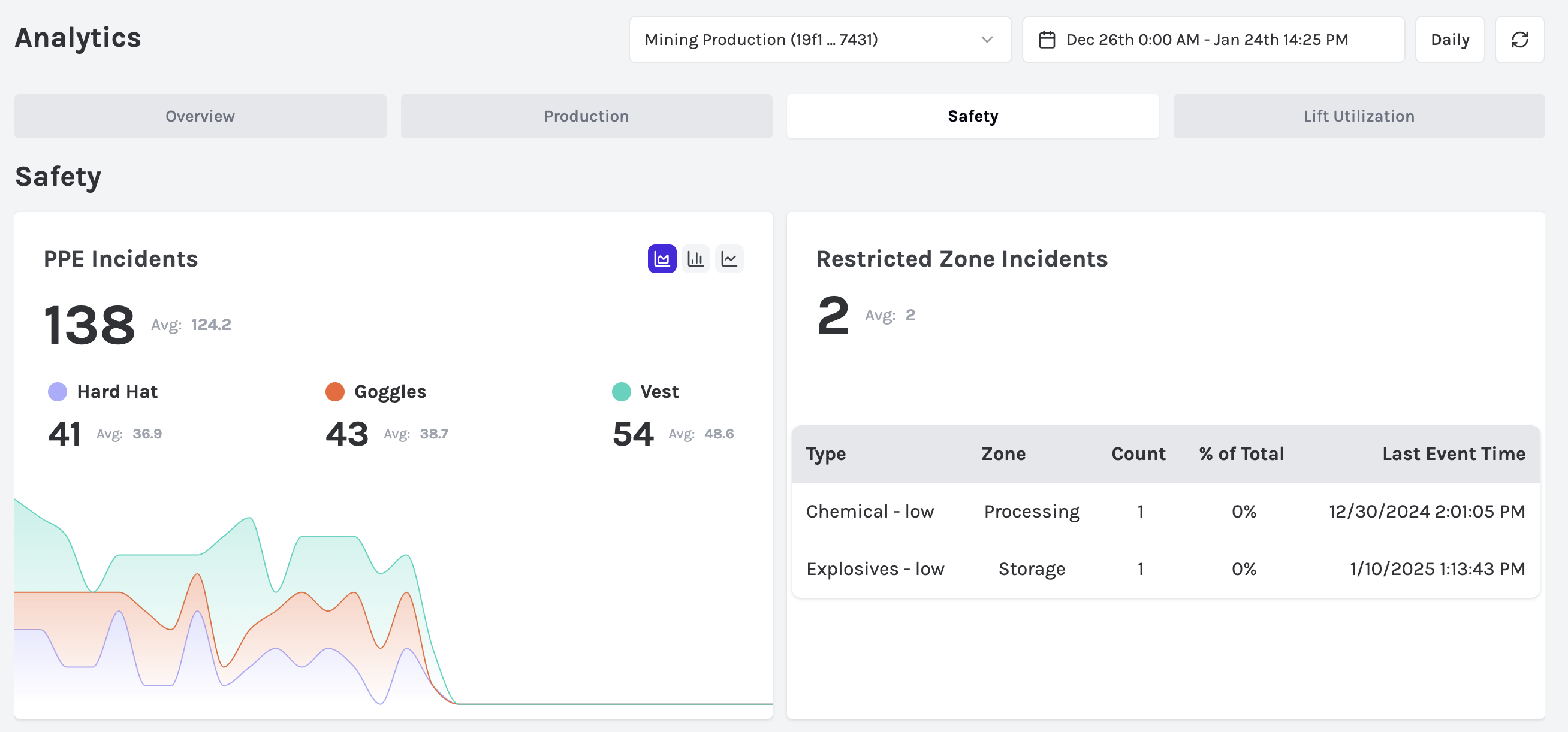
The following corresponds to lines 461-511.
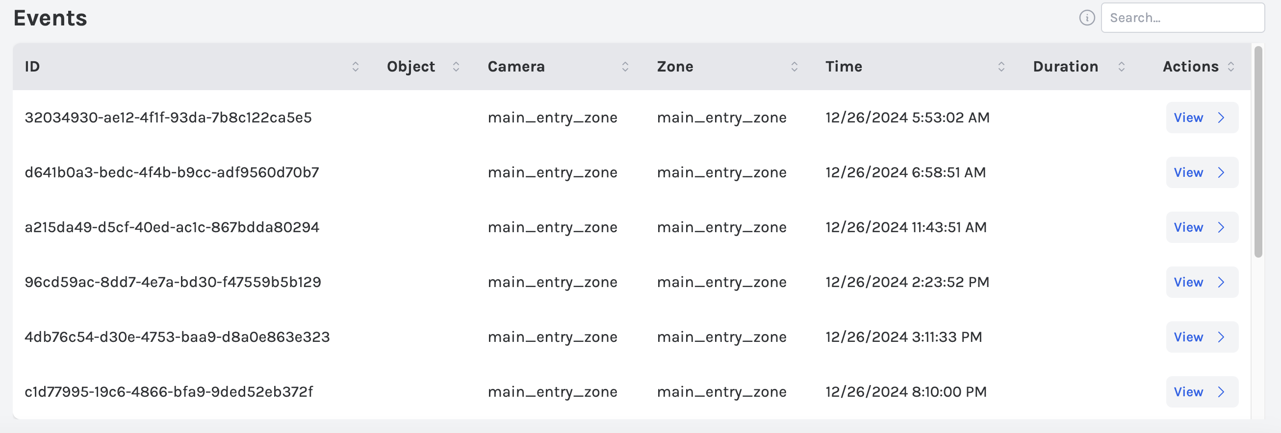
Mining Lift Utilization Tab
The Lift Utilization tab corresponds to lines 514-643.
The following corresponds to lines 517-589.
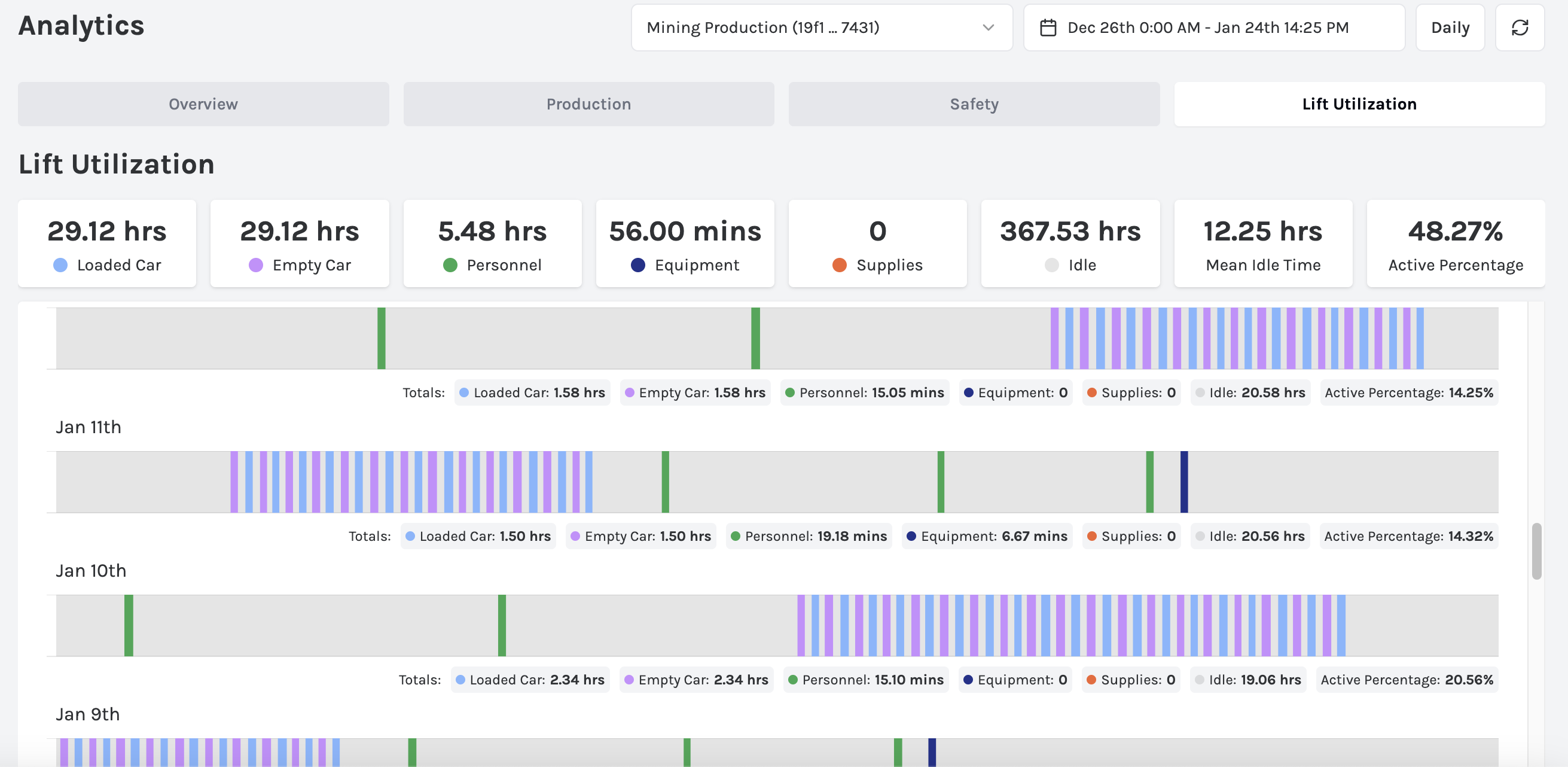
The following corresponds to lines 590-641.
